As
scrapbooking evolves into an art form, more and more artistic design
principles are being used on scrapbooking pages. One is the creative use of
significant empty space or "white space" to create drama and draw the eye to a
focal point, as well as to give an overall clean,
designer look.
The
best way to do this is to section off your layout into a grid, such
as quadrants or maybe thirds and
place a majority of your photos and embellishments within one
quadrant or in a center quadrant (doesn't have to be exactly in the
quadrant, just in the general area). Build your layout outward until
you are satisfied with the results. You can add just a few photos or
embellishments for a clean and simple look, or keep layering
to create a more complex piece. Try
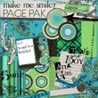
this design principle in your next layout. This month's
"Make Me
Smile"
Page Pak download has both white and black papers, which create a great
foundation for these types of layouts.
Remember...no matter how much of an
artistry scrapbooking takes on, it's
real meaning and beauty lies in the story shared in
every page through photos and journaling. There can be a
temptation to get so involved in the latest look that the true meaning
of why you're making the page can be
lost. Be sure to make room to document your emotions and the story
behind the photo(s). Don't get too worried about how "good" or
professional it looks, but how well you have preserved the moment
for future generations to enjoy.
ALL DOWNLOADS on SALE
through Tuesday, July 4th. Enjoy...
Happy Scrapping!
Doris Castle, Co-Editor
and The Team at CottageArts.net
|
 |


