beth ervin. photo credit: sxc.hu.layout details here
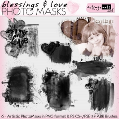
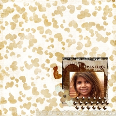
Using clipping/photo masks in conjunction with photos is the common function of these artistic tools, but they can also provide a wide range of decorative effects using just a little imagination. See below for some different techniques using our new Creative Text Paths/Masks 3 and Blessings & Love Photo Masks.
(Enjoy our big Everything’s on Sale Sale, too…thru Sunday!)
all layout details here
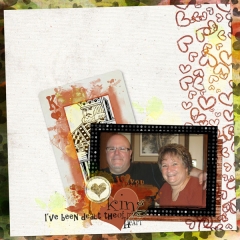
In King of My Heart I sandwiched a colorized mask between two layers. Using the King of Hearts card from the Game Night Pak, I duplicated the card layer, selected/copied/pasted just the king, placed the mask on top of the full card and added the new king layer on top of this collage. To adjust the color, select Enhance>Adjust Color>Adjust Hue and Saturation and in dialog box, check the Colorize box, Hue to 18, Saturation to 86, Lightness to 30. In the Layer Palette I adjusted this layer’s opacity to 65%.
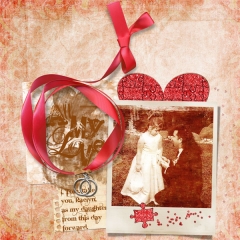
In My Love the mask is framed with a red ribbony frame and softened using Gaussian blur. Add a light drop shadow to the mask (I used 25% opacity) then select mask layer in your layer palette, go to Filter>Blur>Gaussian blur. Adjust the radius. The higher the number the larger the blur factor. My sample used 25.
In Sage Sisters the mask is used a baseboard for my title on top of a mat. Again, I changed the hue and this time I intensified the mask by duplicating the layer, which allowed the white title to stand out on top of it. Again a slight drop shadow was added to the lower mask layer only.
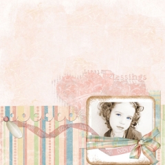
Clipping patterned paper to masks is one of the quickest ways to add a beautiful accent to your digital pages. In pink Baby Girl I clipped the pink flourish paper from Simply Lullaby Pak to the mask by resizing the paper to fit over the mask, dragging paper on top and use <Ctrl>G to clip the paper into the mask shape.
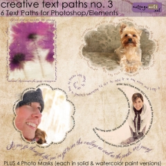
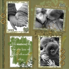
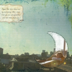
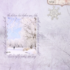
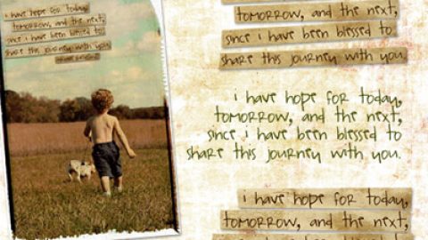
Michelle and Rachel framed their painted mask images with our new Creative Text Paths/Masks 3. Adding a quote or journaling in a beautiful font around these painted images adds more focus to the piece.
See more step-by-step tutorials on our blog for using Text Paths here and Clipping Masks here.
Happy mask creating! Beth


