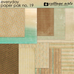
Lots to share today! We just released 6 fun new everyday products (our newsletter with sale goes out Friday morning – check your inbox!), and the team’s been busy showcasing their summer memories with them.
One main reason most of us scrapbook is to remember the daily happenings in our lives…those little things that make our life ‘our life.’ Like what games we enjoy, what restaurants we like to go to, what activities our kids are in, how we spend our time, our hobbies, and on and on. Our mobile devices are with us when we are living out these moments and they make capturing them slick and easy.
With my iPhone 5 I use Camera+ as my camera app of choice. It allows me to select separate focus and exposure points via touch screen. Awesome! Our favorite go-to apps for editing on the iPhone and Rachel’s iPod Touch are Mextures, VSCO Cam, Snapseed, and PicTapGo. And then we use Dropbox or email to get the images onto our computer where we can play with them and our art.
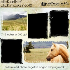
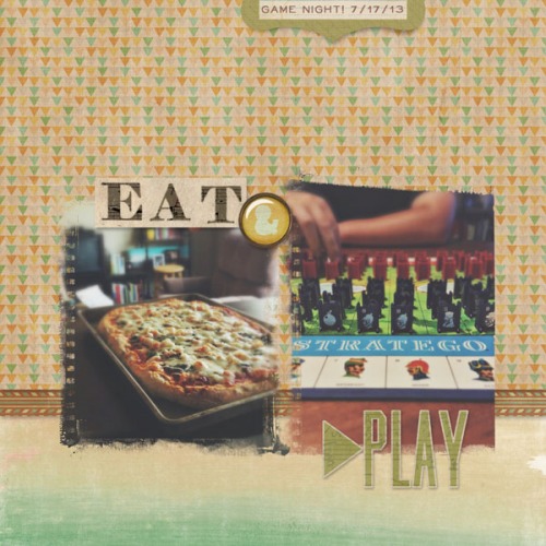
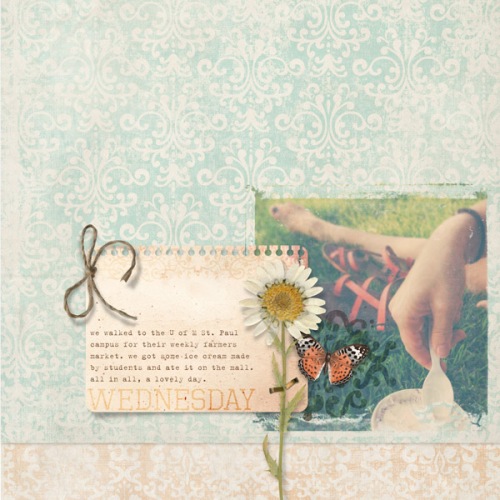
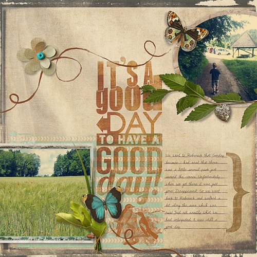
Here Rachel shares snippets of her week using her iPod shots blended with our newest Click.Masks 40.
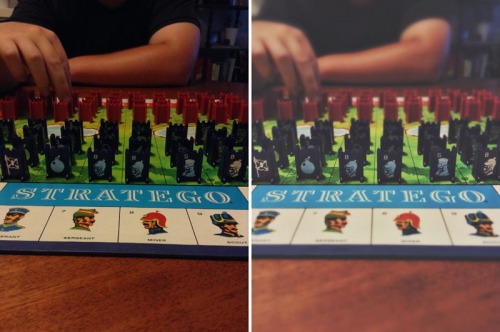
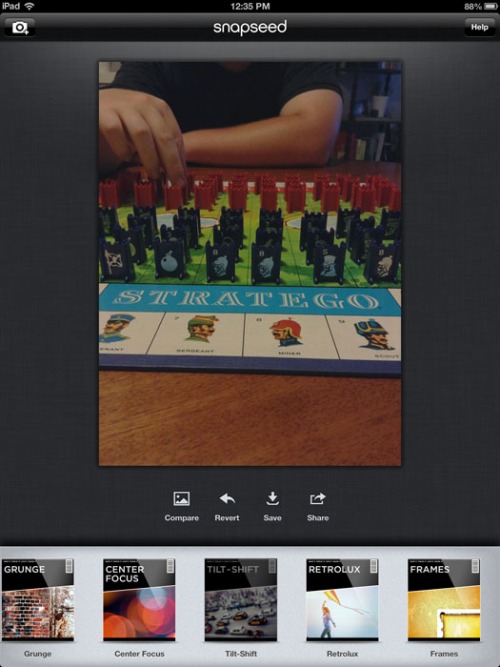
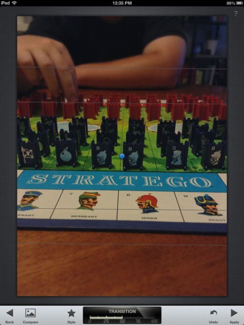
She gave the two layouts’ photos more depth using Snapseed’s Tilt Shift function (a type of selective focus blur effect mimicking a shallow depth of field). This works for these images since they were all shot at eye level and have a foreground and background. Here one before and after:
Here’s how to achieve the effect in in Snapseed:
Open Snapseed app (available for Apple or Android)
Open photo
Scroll along bottom and select Tilt-Shift button
Four horizontal lines will appear. The blurred section will be between the two centermost lines. To increase this space, press two fingers on screen and spread them outward. Press Apply when satisfied. Note: you can rotate the lines to rotate the direction of the blur, as well.
That’s it! Press save. Share to your desktop via preferred method (Dropbox, email, etc).
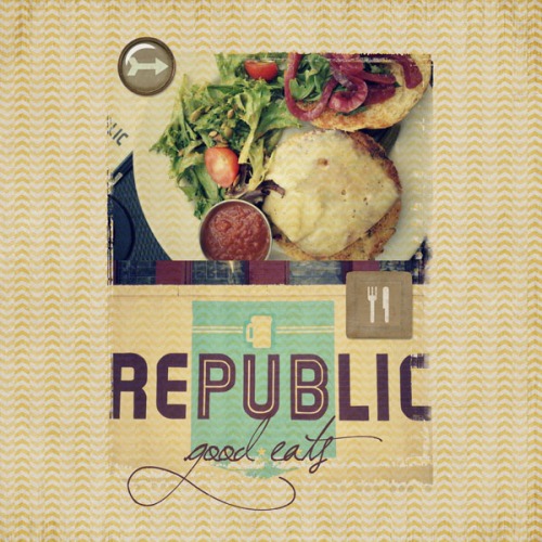
With this next layout, she captured a fun birthday meal at a local eatery. Since it was shot from above, everything is on the same plane and a Tilt Shift effect would not be recommended. Another great everyday design element is to take photos of road signs, city signs, restaurant logos/menus and use them on your pages.
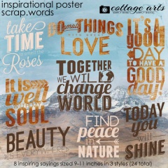
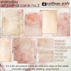
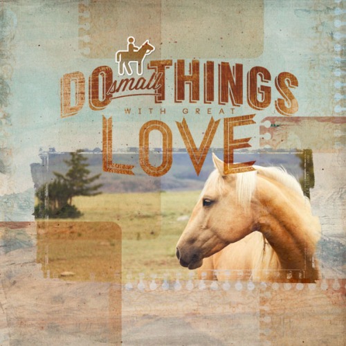
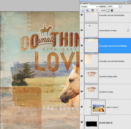
While on our recent vacation to Montana, we made fast friends with the neighboring horses. I always had my iPhone with me when going for walks and this beauty, in particular, loved posing! A quick moody edit in VSCO Cam and the photo was ready for making a poster. For a unique design twist, I layered our new Everyday Art Journal Cards 2 all over the landscape background, using Multiply blend mode within Adobe Photoshop Elements (Photoshop and Corel Paint Shop Pro would give same results). It gives a fun patchwork texture effect without being overpowering.
Here are how some of the layers are stacked and blended (click to enlarge):
Rikki loves using our Scrap.Templates and Scrap.Frames with her iPhone/ Instagram shots to quickly share her everyday moments. She says she is now completely addicted to Instagram!
These are just a few of the ways our mobile devices and apps make everyday digital scrapbooking even more fun!
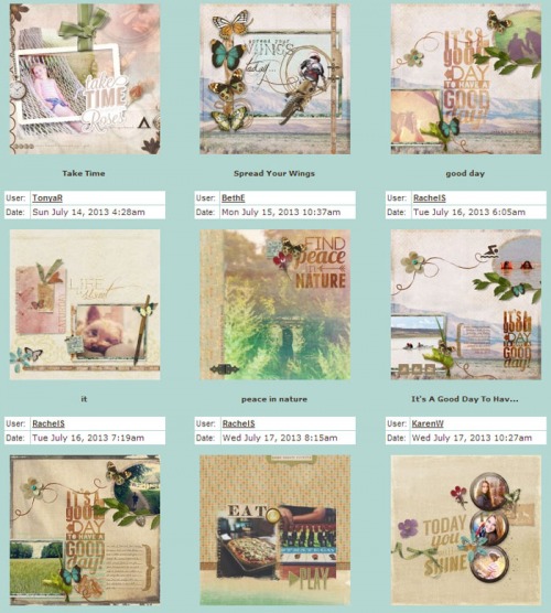
And see our Everyday gallery for layout details and more of our newest inspiration by the team!
Happy creating! Michelle and team

