Revised to add: See an additional Click.Mask tutorial here.
======================================
Hello! Jolene here with a super fun technique using Adobe Photoshop (or Photoshop Elements) clipping masks. Our newsletter last week had a similar tutorial, however, this includes the screen shot visuals.
One of my favorite things about digital scrapbooking is the versatility of the graphics! Colors can be adjusted to better coordinate with photos, textures exploited, and papers no longer have to be simply papers! Clipping masks have been my soupe du jour lately. Once you see how simple they are to use, you won’t be able to resist giving it a shot! A brief summary of what they do – the top layer, with all of its glory, takes the shape of whatever you have directly underneath. And of course, the effect can all be modified using layer blend modes!
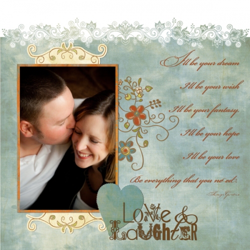
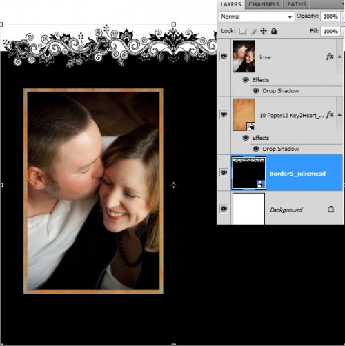
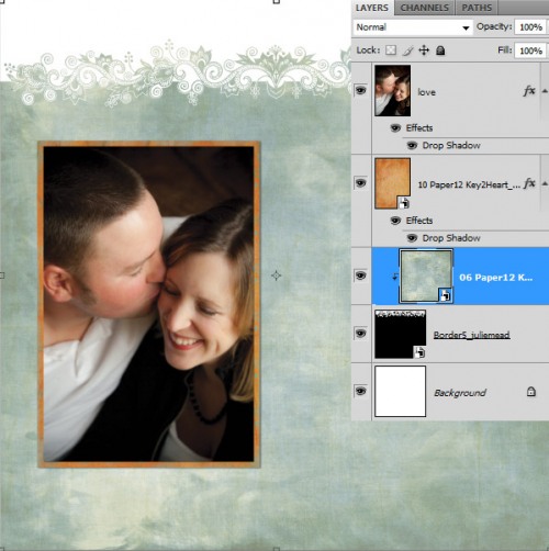
In this layout, I’ve started the bare-bones of putting together my page. I’m using a Power Border, however, don’t want to simply change its color. I’d like to fill it with a patterned paper from Keys 2 My Heart Pak. This is where clipping masks come into play!
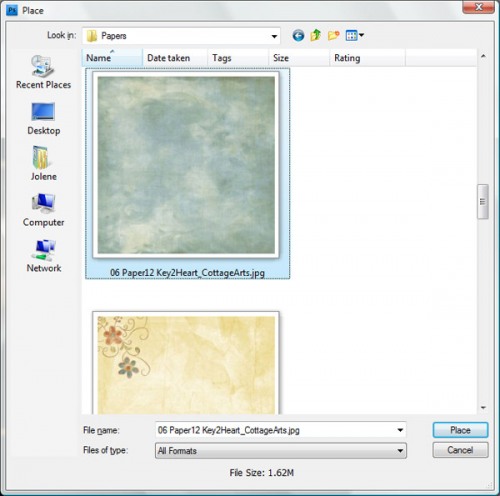
Using File>Place I browse my system folders and find the paper that I’d rather be using and highlight it, then click Place.
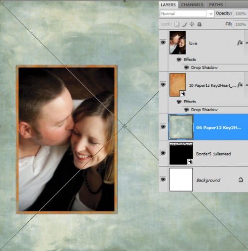
Press Enter or click on the check mark to Commit Transform. Use the move tool to position the paper if it isn’t where you desire.
Since I had my power border highlighted/active before doing this step, Photoshop will place this paper directly above the power border layer, centered in the open document. If your paper didn’t end up where you expected, simply drag it above the layer you want to modify, in the layer palette.
Ready for the magic?? Here we go!
Click on the thumbnail of the paper in the layer palette and in:
PSCS and above – press Ctrl+Alt+G (Cmd+Opt+G for Mac) or choose Layer>Create Clipping Mask
PSE 3 and above – press Ctrl+G (Cmd+G for Mac) or choose Layer>Group with Previous
and… VOILA! Your top paper layer has taken the shape of the power border layer that is underneath! The options with this are endless.
Some other examples of how it could be used…
- Make a border of simple shapes with the custom shape tool and merge them into one layer, using it as a clipping mask.
- Use text layers as clipping masks
- Any shape in our product line without shadows makes for an awesome clipping mask, such as hearts, stars, flourishes, Scrap.Edges, Photo Art Blends, brushes, etc.
Some additional tips to keep in mind:
- If your top layer has a pattern, grab your move tool and move it around to see how it changes the look.
- Scroll through the different blending modes (on the lower shape layer) or adjust the opacity to change how the top layer interacts with the bottom layer.
- Experiment, experiment, experiment!
Have fun using this technique on your next layout!

