Happy Friday, everyone! Lots of info to share today and some fun inspiration from the team. First off, it’s time for an April blog coupon. Get $5 off any purchase of $20 or more in our shop with coupon code: APR5. Coupon expires April 30, 2009 (enter code during checkout process). Plus, all CDs (Training and Simply Digital graphic CDs) on sale for the month of April.
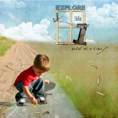
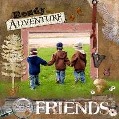
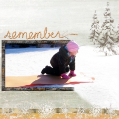
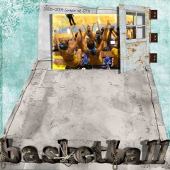
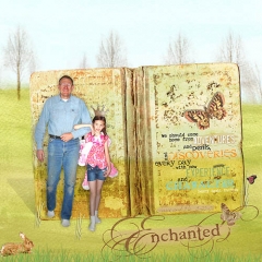
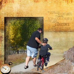
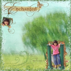
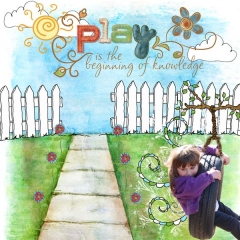
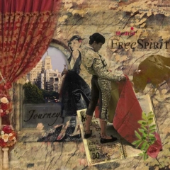
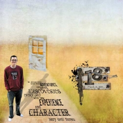
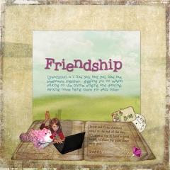
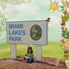
This week’s team challenge was to create perspective layouts. What are perpective layouts? They are pages that evoke a 3D feel to them, either partially or entirely. It’s all up to the artist and the effect they are trying to achieve. See the end of this post for some super creative pages by our team using perspective in varying degrees.
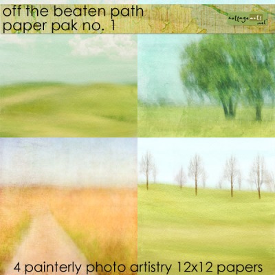
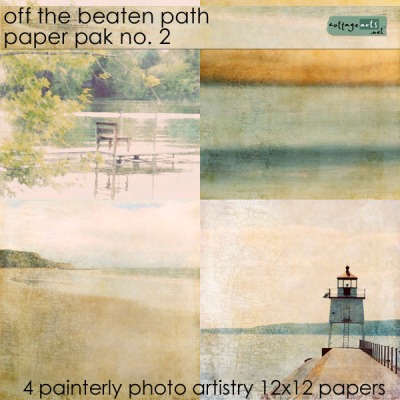
Off the Beaten Path Papers are my first in a series of products developed for 3D creative fun. I’ve given my landscape photography a painterly feel for a soft background that doesn’t steal the show, but complements it.
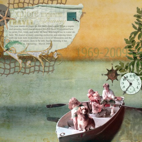
Below is the layout I created for our team challenge, using the water/sunset background from the second set of papers.
The key aspects in creating believable perspective artwork fall into the following categories:
1) Photo selection and extraction – Choose photos that fit the scene you are trying to create. For my page, I selected an image of my husband and his family in a row boat on a lake. Because I was going to position it on a water background, it was easily extracted to fit believably into the scene.
2)Light and shadowing – Watch how light falls on the subject in the original photo and replicate this in the page. See how I mimicked the shadow from the oar and boat for the overhanging tree branches by adding a relection in the water? As you’ll see in my tutorial (next blog post), I added a lighting effect after the page was complete to add more realism to the piece.
3)Background selection – Scenic backgrounds work best for The water background makes for an easy insertion of the boat image. As you can see, I made things easier by aligning the front of the image with the edge of the paper so I didn’t need to paint in the front of the boat. It also adds a unique position for the page focus.
4)Embellishment usage – Adding natural elements like netting and a starfish, I carried out the beach theme. However, my intention wasn’t to make the entire page 3D…I did add the overhanging branches to give the feeling of being close to the beach which was the case in the original image. I added the reflection in the water for the branches to make this part of the scene. The other elements are used to tell the story.
My next blog post will share a tutorial on creating my perspective page, but I can’t wait any longer to share the team’s amazing creations. You can see details of each page in our Perspective gallery. Enjoy! Michelle


