Edited to add: See Sunday’s birthday celebration blog freebie here
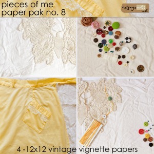
pieces of me 8 papers, nature’s sketchbook journals 12, by the sea pak, typewriter alpha, flowers, freebie below
Here we are again! Time for our annual Birthday Celebration! Alyssa finishes her third year of college in a few weeks and will embark on a study abroad program, Rachel completes her first year of college studies, and Philip will be ending his middle school experience…and marching along with them, CottageArts.net is 8 years old! Thank you so much! This weekend is our way of thanking you for all of the fun! Details and prizes are outlined in today’s newsletter. To receive future newsletters, free sign-up is here. We’ll likely be sending out another newsletter Monday if you missed this one.
We’re celebrating with 33% off DOWNLOADS for 4 days (even new products)! (excludes Photo Art Blends which are 20% off). Additional coupon code in newsletter. Sale ends Midnight CT, Monday, April 18, 2011.
And, for each of the next 4 days we’ll have team inspiration and a blog freebie download for the day here, which will expire at 8 am CT the next day (like the past few years, they’ll be available in our shop afterward if you miss them).
Today’s theme is going back to our roots, our heritage, as that is how we started Cottage Arts. My love for old photos and the stories that went with them is where my love of scrapbooking came in and then how digital scrapbooking took hold. The ease of using a scanner and creating layouts with those old images set the stage for a passion that continues to inspire us each day here at our little space on the world wide web.
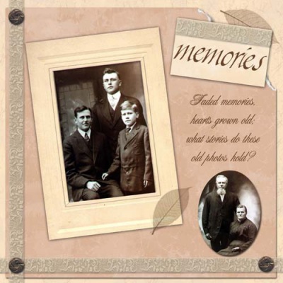
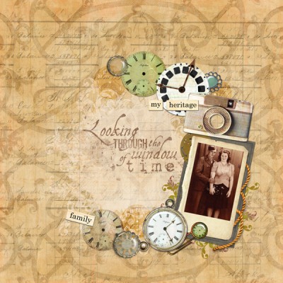
Here’s one of my first digital layouts from 2002 of my paternal great grandparents and grandfather! It’s amazing how colors, trends, and styles evolve, right???? I still love heritage and soft shabby textures, though!
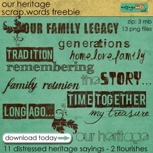
Below (end of post) is a set of free distressed heritage titles for your digital artwork plus two flourishes/tails to adorn them or other accents. No drop shadows. Come back tomorrow for more goodies and inspiration!
beth ervin
- Open Photoshop or Photoshop Elements
- Open desired digital background paper for layout (sample used Pieces of Me 8 Papers)
- Open photo(s). Drag onto layout. Size and position.
- Open embellishments. For this I used a pre-made journal with frames as my main element. Drag onto layout. Size and position.
- Add drop shadows to elements that don’t have pre-made realistic shadows on them already. For assistance see our drop shadow tutorial and canned drop shadow layer style blog post.
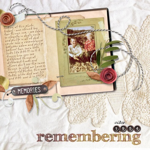
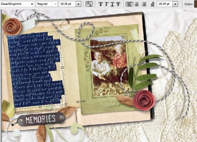
- Use Type Tool to add journaling. For mine, after selecting Type Tool, font, font color, and size I clicked on layout over journal and drew a text box the size of the left panel of the journal and then rotated it to the same angle. Then I clicked at the top left of the text box and started typing. This technique allows you to change font and font size and the words will auto wrap inside the shape of your text box for you. See our pre-made Text Path products with tutorial here.
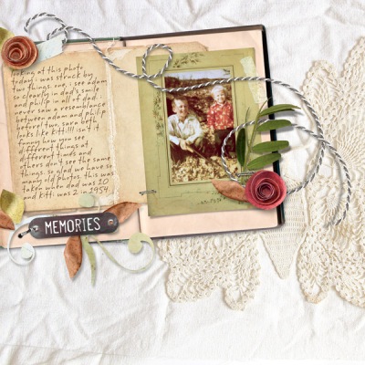
- Here’s how it looks so far. Pretty good but not quite done.
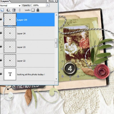
- Now for the fun part! Open desired AlphaSet. We used the new/old Typewriter Keys set. Open all the letters. Drag onto layout. They will all be dragged on top of each other in center of layout. Tip: if they don’t show they are positioned beneath the background paper or journal. Simply click and drag on the thumbnails in the layer palette to move upward. Or click on all of them in layer palette, choose Layer>Arrange>Bring to Front.
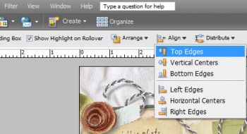
- The newer versions of Photoshop and PSE have a sweet align function. So fun and easy to use. Using your mouse or pen tablet, position your alpha about where you want them. Then, if you’re a perfectionist or like things to be neat and tidy simply select the Move Tool, click on all of them in the layer palette, at the top in the Tool Options panel click on Align>Top Edges (or Bottom Edges) and voila! You can also left align or right align.
- At this point for ease, I merged the alpha layers into one layer so I could move, resize, and change the color a touch as one single unite. The keys are pretty big so I downsized them a touch, too.
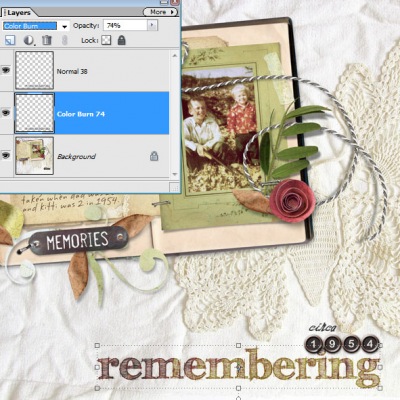
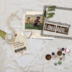
- Now open and drag on one of the freebie word art titles. We used the sketchy remembering. To get a look like it was stamped into the fabric I played around with the layer blend modes and duplicated the word art. On the lower layer I set it to Color Burn at 74% and the top layer to Normal at 38%. Adding this lower opacity normal layer on top dulls down the intense impact of Color Burn. Isn’t it cool how Color Burn adds color to a solid brown piece of word art? Love this look on the fabric!
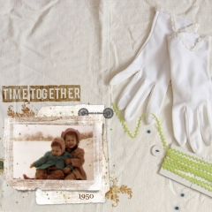
Get even more creative. Play with layer blend modes for different effects on word art and AlphaSets. Reduce opacity to dull a vivid accent or decrease the saturation to give a more vintage vibe (Ctrl-U, Command U on a Mac). You can also duplicate layers to intensify elements and apply a different blend mode to each. Below, Rachel added two layers of one of the free titles, Time Together, and set them both to Overlay blend mode giving a nice stamped effect on the nubby muslin background. Have fun!!!!
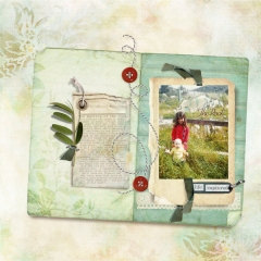
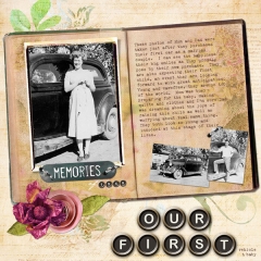
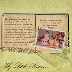
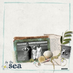
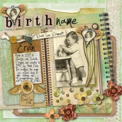
The team has also created some pretty heritage pages. All layout details in our gallery here.
melinda ver meer
New products will be added throughout the sale in our shop. Here are today’s new releases.
And…we’ve turned on blog comments for the celebration (to control spam we normally have them turned off)! Let us know if there are any photography or digital art techniques you’re interested in learning more about. We’ll try to get to them as soon as we can! At other times of the year, you can always reach us at the Contact link at top right. We love to hear feedback, see your creations, or answer questions.
Our Heritage Scrap.Words Free Download by Michelle and Rachel Shefveland (Download expired 8 am CT, Saturday, April 16th, ). Download size is 3 MB (13 png files).
Enjoy! Michelle and team
 |

