rachel shefveland. details here
My sister Alyssa is a dancer. Now I don’t mean that her profession is dancing, or that she teaches dance, or that she even takes dance lessons (well she used to). But Alyssa just dances. Constantly. Around the house, in the grocery store, when she’s driving (you thought texting while driving was bad!), and probably even in her sleep. People are always telling me, “Did you know your sister bounces when she walks?” She really does; it’s like her feet just can’t not dance! Before she was walking, she would move her little baby body to the music (which my parents constantly had on when we were growing up — whether it was Kenny Loggins, Journey, or Alabama, it was always a jam session). She went to three different dance studios from the age of 5 to 16, took ballroom and African jazz dance classes in college, and continues to find outlets for her dancing needs (even when it’s doing pirouettes through the aisles of Target and I’m pretending like there is absolutely no relation…). But to be honest, it’s what makes Alyssa, Alyssa, and I wouldn’t want it any other way.
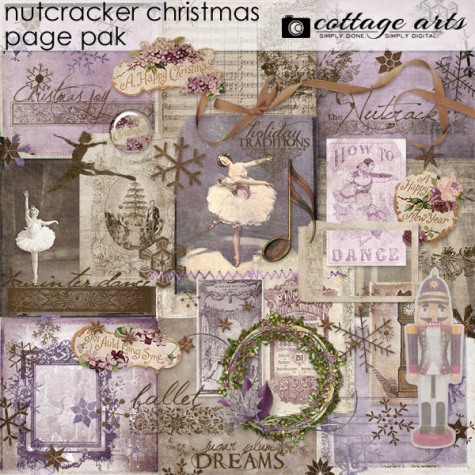
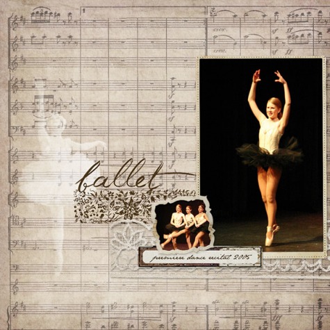
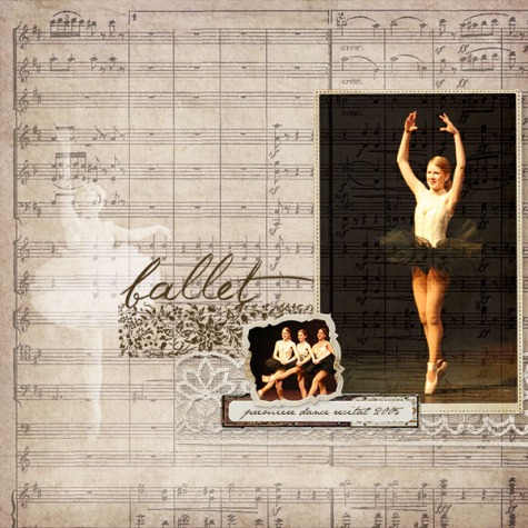
So, I made this layout to capture one moment of her dancing journey. Here’s a little how-to on creating with Adobe Photoshop or Photoshop Elements and our new products this week (on sale through Sunday, December 23).
- Open Adobe Photoshop or Adobe Photoshop Elements
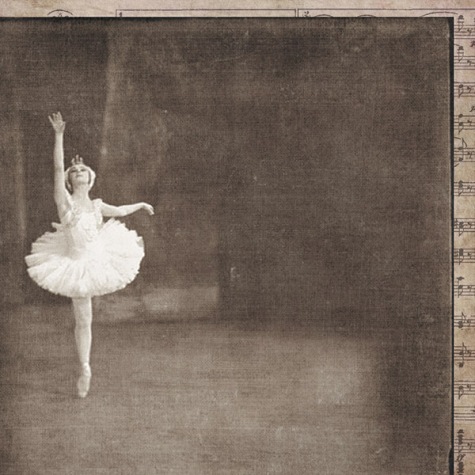
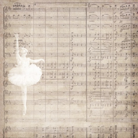
- Open a 12×12 paper (we used 01 from Nutcracker Christmas)
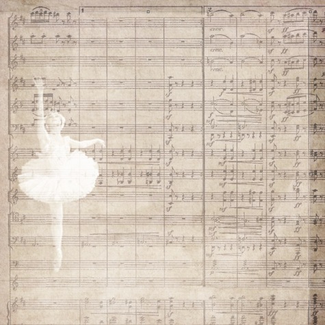
- Open a second 12×12 paper (we used 05 from Nutcracker Christmas). Drag and drop it onto the 1st paper. Position and resize as desired with the Move Tool.
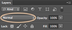
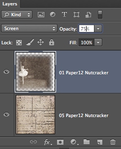
- Experiment with layer blend modes to see which looks best with the papers you have chosen. A quick reminder as to how to do this, select the dropdown that says Normal located in the Layers Panel and scroll through the options (to give this dancer a subtle look, we set the blend mode to Screen)
- To soften the harsh edges seen here, select the Eraser Tool and choose a soft round brush with a large diameter (1000px) and an opacity of about 60-80%. Stroke the brush in a straight line against the edges of the paper, erasing as much or as little as desired.
- Here we decreased the opacity of the paper to 75% to really blend it in nicely, experiment with the opacity to see what you like.
- Open elements, frames, photos, etc. that you wish to place on your page. Arrange as desired.
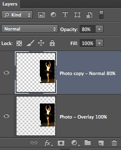
- This photo of Alyssa is too harsh against the rest of the page. To give it a softer blended look, we set the blend mode to Overlay. Then duplicated it, set the blend mode of the copy to normal and the opacity to 80%.
- And there you have it, multiple blend modes to make one beautiful piece of art!
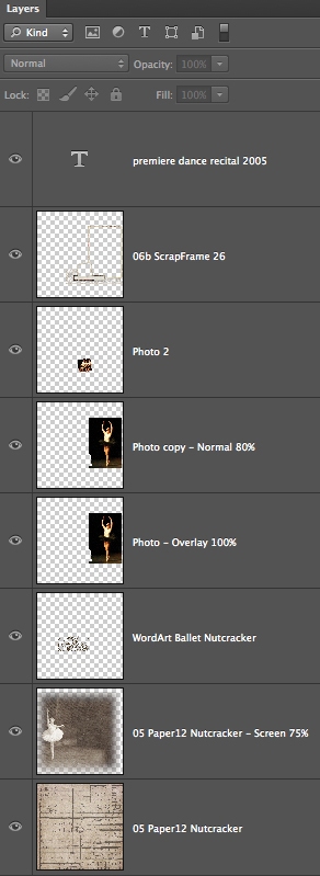
- Here are all of the layers that make up this layout:
Merry Christmas and happy holidays to all of you from our family to yours!
Rachel
P.S. I used to dance a bit, too, in my younger years…
layout details


