Hi everyone! Stopping in for another perspective tutorial…this one offering some little tips on blending the image into a background and on using props.
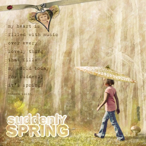
Here’s the page:
Supplies: Off the Beaten Path 3 Papers, Nature’s Sketchbook Elements 2, Soldered Sentiments 2, Adventure Pak (caterpillar) Simply Spring Scrap.Words (ladybug), Blog Freebie (title and quote)
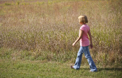
Here’s how the image started out:
My niece would have blended nicely into the grassy floor of the chosen background, but I wanted even more believability.
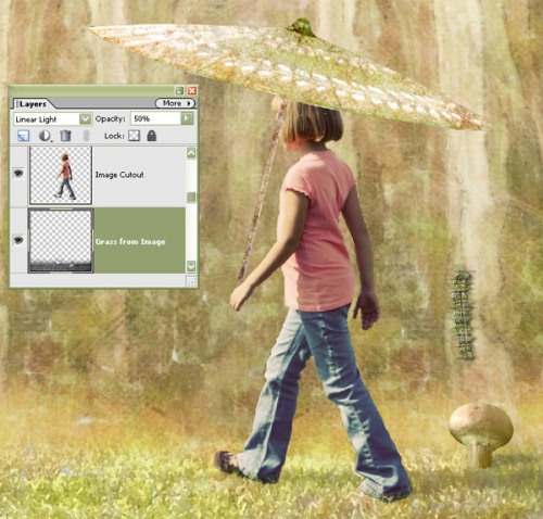
To accomplish this, I first dragged the image of my niece onto the background (Birch Forest from Off the Beaten Path 3 Papers), colorized her image to have a retro feel, then duplicated this image layer. I used the Magnetic Lasso Tool for an exacting extraction of her body on the top image layer (cleaned up the edges with a small hard edged eraser tool at 100% opacity). On the lower layer image, I desaturated the color completely and erased everything but the grass. I then applied a dry brush painting filter effect to the remaining grass (Filter>Artistic>Dry Brush), and set the layer blend mode of the grass to Linear Light at 50% opacity. This gave a bit of a more realistic floor for her to walk on, even though the paper itself would have been just fine.
For a prop, I dragged on one of our new umbrellas in Off the Beaten Path Elements 1 (coming soon), then flipped it horizontally (Image>Rotate>Flip Layer Horizontal) so the light was coming from the same direction as it was on her (from the left). For the mushroom (from Nature’s Sketchbook Elements 2), I added a custom perspective shadow mimicking her body’s shadow, which showed softly on the paper/grass. The blog freebie coming tonight contains the quote and the 3D title (comes with and without perspective shadow), which I just dragged on the page to finish it off, along with the ribbon, ladybug, caterpillar, heart charm, and additional image. Just a fun page celebrating spring.
My last post has a more in-depth perspective tutorial if you’d like more information.
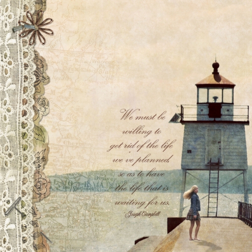
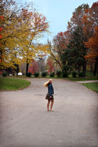
For another snippet of inspiration, here’s a page created by Rachel using a favorite image I captured of Alyssa during one of her grad shoots. It shows how simple these pages can be, yet still evoke a powerful message to the viewer and creator. She sure rocked the shadow on Alyssa!
Supplies: Off the Beaten Path Papers 2, Nature’s Sketchbook Elements 3 (t-pin), Nature’s Sketchbook Elements 2 (lace), Nature’s Sketchbook Ivy League Pak (staple), Torn Newsprint Elements, Simply Moments CD (quote from fall flutter pak on cd)
Happy creating…and we wish you a blessed Easter week!
Michelle

