Art Journal Couture Papers, By the Sea AddOn 2 (click.mask), Organics 2
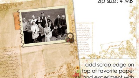
Hello! Wanted to share some ideas for blending click.masks into your digital artwork as there are so many variations and when combining clipping with blending there are a few added considerations. FYI…see our introductory tutorial on using Click.Masks here.
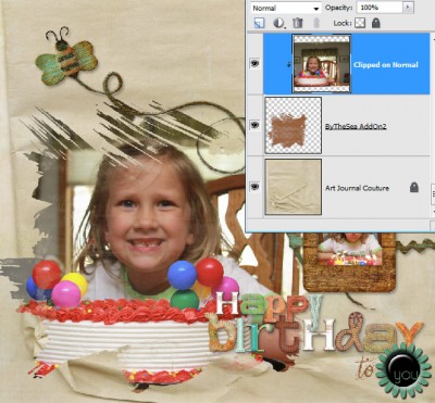
In my example above, if I would have simply clipped my photo to the original brown Click.Mask without adjusting the blend mode we would have this…the image and edges are too intense for me. Note: Click on images to enlarge.
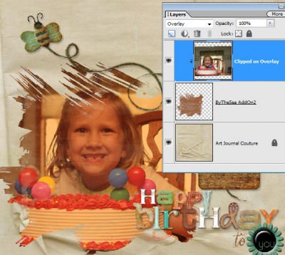
If I adjust the blending mode of the image to Overlay, too much color from the Click.Mask is picked up.
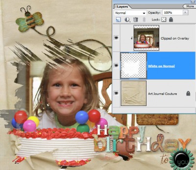
If I re-color the Click.Mask to white (Ctrl-U, Command U on a Mac, adjust lightness to 100) and set image blend mode to Overlay, again too intense of edges.
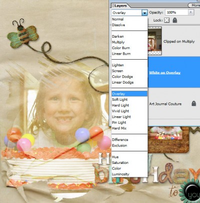
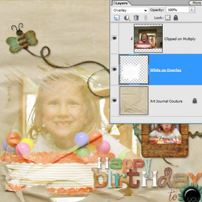
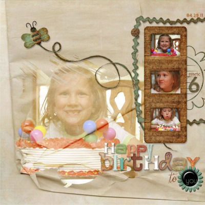
But we’re almost where I want it now! By experimenting I really like the arrangement when the clipped image is set to Multiply and the white Click.Mask set to Overlay. This allows more luminosity and less intensity for a gentler effect (which I desire for an image that is not the focal point but an added accent).
Keep playing and experimenting, as there are no right answers!
Michelle


