rikki donovan. details here
Hi. Rikki here today with a fun how-to using our Click.Masks in a different way, opening up even more creative possibilities!
I love masks and use them on almost all of my layouts one way or another. Masks are versatile. You can even get more use out of them by inverting them.
Here is how you do it (using PS CS 2 – Adobe Photoshop Elements follows similar steps):
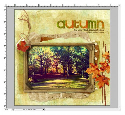
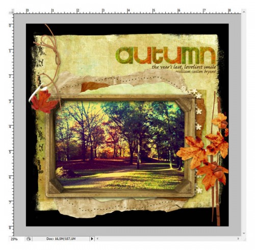
I had this layout almost done, but felt like there was something missing around the edge.
It was too light for me and I wanted something like a green frame around it, not too dark, more like a grungy mask. But I had no frame mask that I could use. So I decided to use a clipping mask from the Nature’s Sketchbook Photo.Blends No. 3 and went for mask 08.
Shift+drag the mask onto your layout, so it is positioned in the middle of the page.
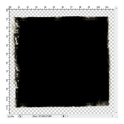
Create a new layer above your mask layer. Ctrl+click (Mac: cmd+click) on the thumbnail of your mask layer to select it and press Ctrl+Shift+I to invert the selection (Mac: Cmd+Shift+I).
Make sure your new empty layer is active in the layers palette and fill the selection with black. Make the layer with the original mask invisible.
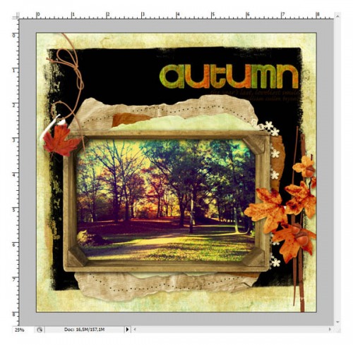
Now you have a new mask that frames your page. Choose your desired paper (I used a green paper from the Soccer Page pak), drag it on top of the new mask and clip it to it with Alt+Ctrl+G (Mac: Optn+Cmd+G). If you find it too strong an effect simply change the opacity of the mask layer to let the underlying layers show through.
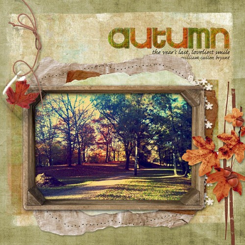
Here’s the final layout:
rikki donovan. details here
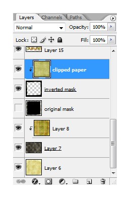
And this is my layers palette:
You might ask why I didn’t just put the green paper at the bottom, use the mask as is, clip the other paper to the mask and put it on top of it so it shows only in the middle of the page. Two reasons:
- I wanted to use my frame paper on top of another masks (you can see it in the layers palette below the frame mask) and had I used it as a background I couldn’t have done that.
- If you use the frame mask you can let the bottom paper shine through by lowering the opacity. Here is an example to show you the difference.
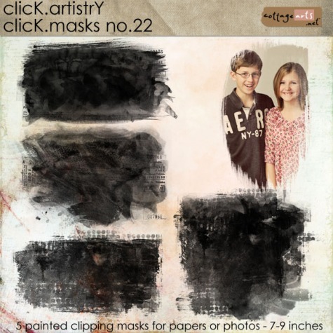
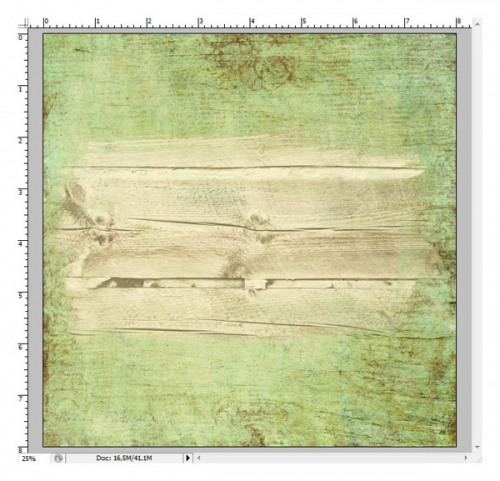
On this next layout I’ve begun, I would like a wooden background paper peeking out in the middle and a colored paper around the outside. (I am using papers from Winter Birch papers and mask 02 from Click.Masks 22).
Now, with one of my regular photo masks I would need to use the colored paper as background and use the wooden paper to clip it to the mask on top. It would look like this:
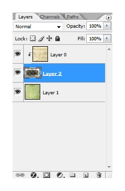
My layers look like this:
Looks ok, but I would like the wood grain of the background paper to shine through to make it look a bit more organic. However, in above page I have no wooden background, but only a wooden spot in the middle, right?
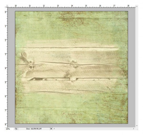
But when I do the inverted mask trick I am able to adjust the amount of wood grain to expose.
It then looks like this:
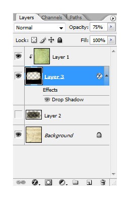
And the layers:
Here’s the final result!
rikki donovan. details here
And now, have fun inverting masks!
Rikki

