Everywhere in life we hear about balance…balancing our work, personal, emotional, and spiritual lives. When things are out of whack, well, we just feel off. It’s the same with a page layout design!
michelle shefveland. supplies here
So, how do you know if your scrapbook page is unbalanced? You’ll sense that something isn’t quite right. It’s like carrying a tray with a lot of glasses – if the weight is not distributed evenly, the tray will tip. If you are struggling with the aesthetics of a layout, chances are pretty good that the layout is unbalanced. A tip that may help is to squint when looking at a thumbnail version of your page to see if it looks in proportion.
The first step to start making changes is moving things around to achieve SYMMETRY.
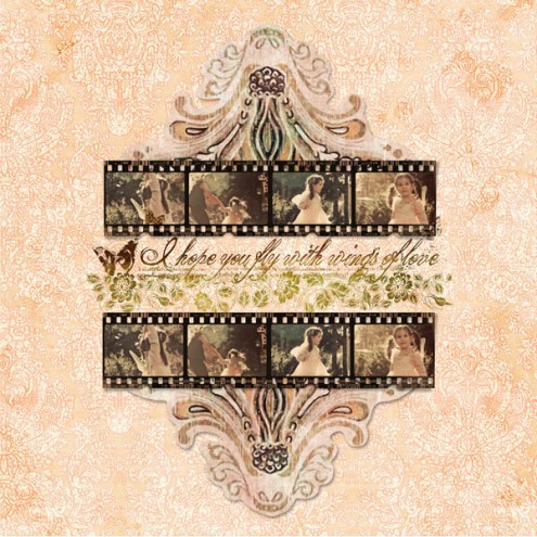
Symmetry simply defined means the balanced distribution of similar shapes or parts that together create a harmonious equivalence.
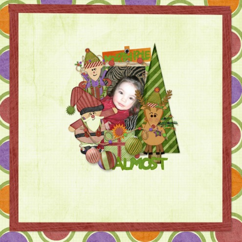
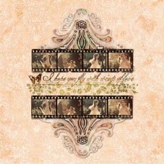
A good place to start and straightforward manner to achieve balance is using a center weighted design.
beth ervin. supplies here
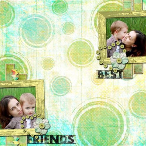
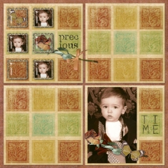
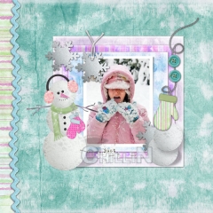
Arranging photos and accents on one side of your page so that they are a mirror image of the other side gives your layout symmetrical balance. An easy idea for a balanced layout involves placing elements with similar visual weights in opposite corners. The center weight of the layout will be a point in the middle. Imagine 2 lines joining each pair of similar objects; the result will be two lines that cross in an X pattern.
beth ervin. supplies here
See below for more inspiration on this topic by our team. Layout details can be found in our challenge gallery here.
Happy holidays! Beth

