michelle shefveland
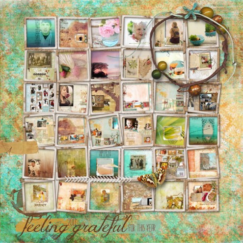
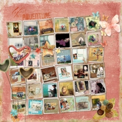
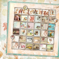
Hello! The team had a blast recently creating mosaics out of collections of past digital layouts. A great idea for a first page of an album or last page, or a re-cap of the year page.
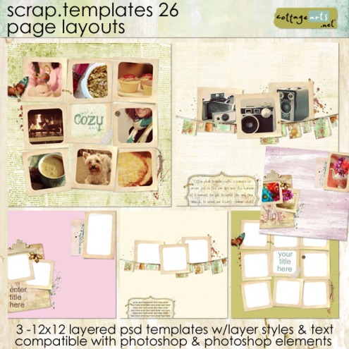
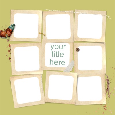
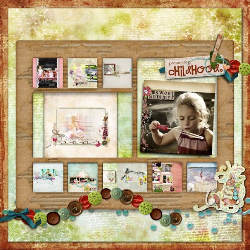
The easiest method for completing a mosaic is to use one of our Scrap.Templates featuring square Storyboard Scrap.Frames – sets 13, 14, 26, 27, 29, and 33 are fitting choices. This will offer you individual clipping masks for each image spot beneath the frame (below Beth used one from set 26). Otherwise, you can use one of our Scrap.Frames and size and position layouts below each opening as I did above.
beth ervin
Here’s how using one of our layered Scrap.Templates with Adobe Photoshop Elements (Photoshop and Paint Shop Pro would follow similar steps):
- Decide on how many and which digital layouts you want to feature in your mosaic. Or, you might want to pick out a template first to decide how many layouts you can use. Both Beth and Melinda used 01 Scrap.Template 26. Tip: I keep printable jpgs of all finished digital layouts in a folder named Layouts (and layered psds in another folder). I can then sort by date to see most recent. I also name each layout with the subjects name and year. So all Alyssa layouts from this year would have Alyssa and 2011 in the file name. You can then search within your folder for such names, making it easier to narrow down.
- Open Scrap.Template
- Open all desired layouts. Flatten if in layered format (Layer>Flatten Image). Note: do not save over original layered file.
- Resize all chosen layouts to approximate size needed beneath frames. Tip: to view ruler in Adobe PS or PSE select View>Rulers (Shift+Ctrl+R or Cmd+R on a Mac). For Melinda and Beth, the frame openings allow for about 2.75 inch squares. I like to drag all of the layouts onto one of them and then resize all at once (Image>Resize).
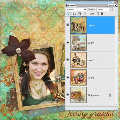
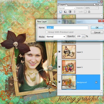
- Click and drag all layouts onto template. Tip: when using this technique you’ll need to unlock the bottom most layer or it won’t drag with the other layers. To do so, double click on the lock symbol in the Layer Palette on bottom layer, Click OK on New Layer dialog box. Select All Layers (Select>All Layers or Ctrl-Click them in Layer Palette), then click and drag onto template.
- Move each one into position. Rotate if desired, as some template’s frames are rotated a bit.
- Move each layout into correct layer position in layer palette by moving right below its frame. Shortcut: Ctrl+[ or Cmd+[ on a Mac to move a layer downward one layer at a time.
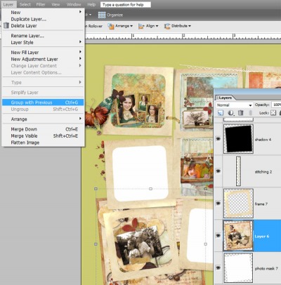
- In certain instances you may want to show only a portion of your layout or photo, therefore having some spill outside of frame until you clip to mask. If so, clip to corresponding clipping photo mask by selecting Layer>Group with Previous in PSE or Layer>Create Clipping Mask in PS.
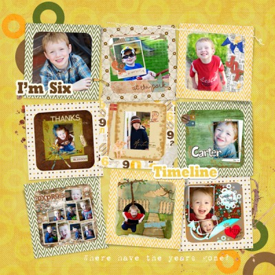
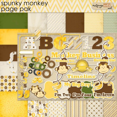
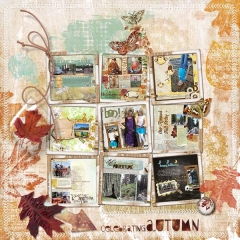
- Now the really fun design part! Decide on the theme and choose a kit that coordinates with the theme. Beth used Autumn Fields as it was used in most of her featured layouts. Melinda wanted to celebrate her son’s sixth birthday with a collection of layouts spanning his life and Spunky Monkey fit his personality to a T! melinda ver meer
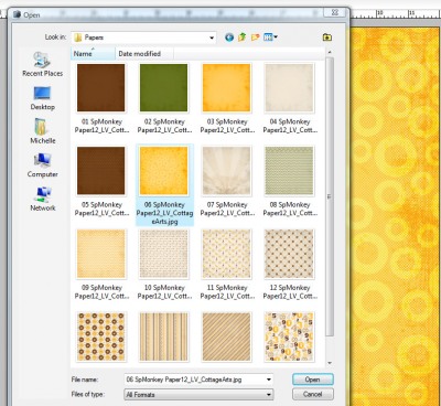
- Open a paper for the background.
- Click and drag into place on top of the background in the Scrap.Template.
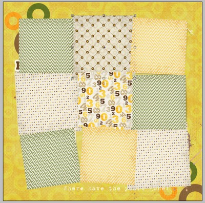
- Melinda also added a creative twist by filling each of the nine frames with a different paper from Spunky Monkey using the frames as clipping masks (using instructions included with each Scrap.Template set). Using Steps 4-8 above, she resized each paper to about 4×4, dragged them onto the layout, positioned them, then clipped them to the frames (size of pattern will dictate how much you want to downsize). Fun!
- Click on title text to activate Type Tool. Choose font, font color, font size and enter title (or add decorative word art as Melinda did).
- Add extra elements if desired, as both Beth and Melinda did.
- Add personal journaling using Type Tool and any text path offered for journaling on the template.
And, here’s how using one of our Scrap.Frames (and digital kits[s] of choice) with Adobe Photoshop Elements (Photoshop and Paint Shop Pro would follow similar steps):
Follow same steps above using any digital papers, Scrap.Frames, word art, and elements to design your own mosaic collage. Disregard Step 11 and simply resize and position your layouts manually beneath the Scrap.Frame openings.
tonya regular
Tonya mixed it up a bit by varying the size of her layouts as well as using a Scrap.Frame without all square openings. Very cool!
Click on layouts below from Karen, Patti, Beth, and I for more variations. See all of today’s layout details in our mosaic gallery.
Happy creating! Michelle

