beth ervin. photo credit: sxc; supplies here.
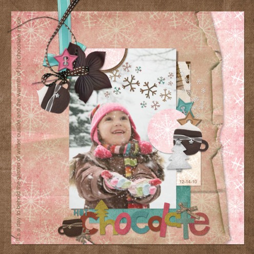
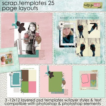
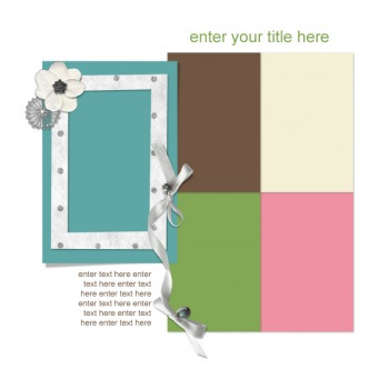
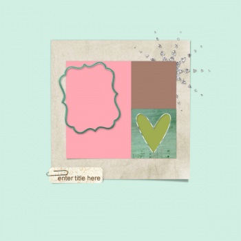
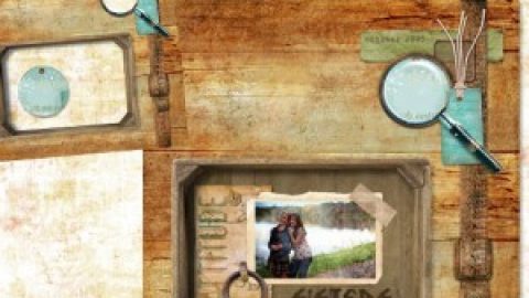
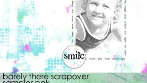
With a new set of Scrap.Templates in the shop, it seems a fitting time to show how easy it is to make them suit your style without looking like a cookie-cutter template. Beth is especially skilled at making them fit her layered, clustery, collage feel.
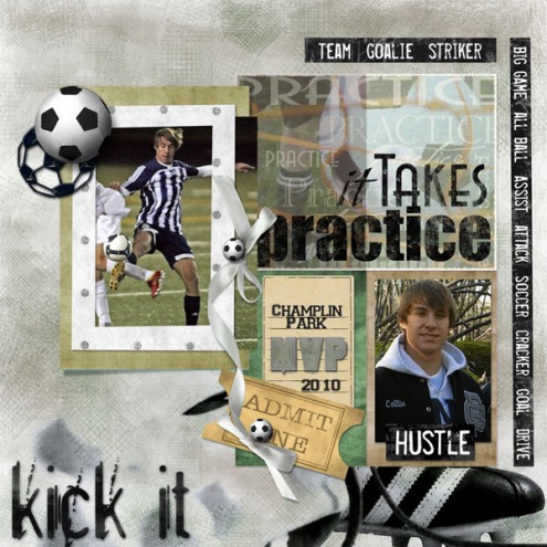
In the soccer layout below, she added papers and elements from our Soccer Pak to this template, while removing some of the more frilly elements.
beth ervin
The page design is versatile for any subject, especially portrait style images. What really makes the page pop for me is her use of designer papers in place of some of the photo spots. Cool.
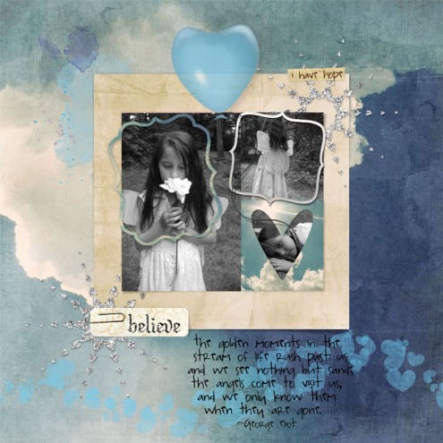
In this next example, Beth added blotches of paint, a whimsical balloon, and cloudy paper to create an ethereal piece. She also duplicated the glitter sun ray (which is so easy on layered templates). What starts as a simple template gets the wow factor with a few custom touches.
beth ervin. photo credit: sxc; supplies here
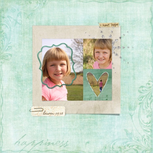
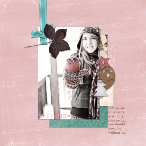
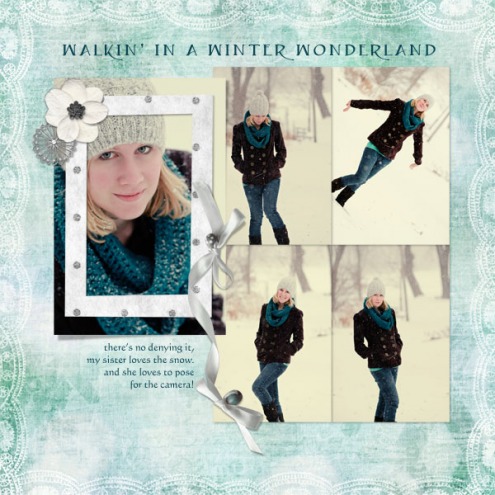
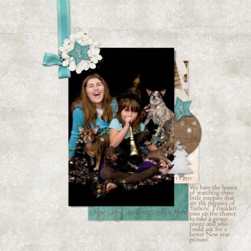
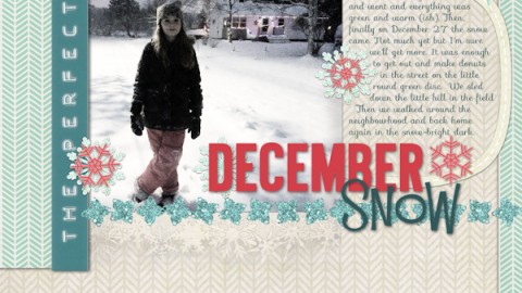
And, here are more ideas using this new set.
michelle shefveland. supplies here
michelle shefveland. supplies here
rachel shefveland. scrap.templates 25, blustery blues pak (paper)
rachael czepyha. supplies here
Happy creating! Michelle

