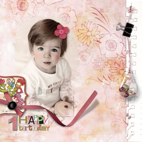
michelle shefveland. supplies here
In meeting scrapbookers and photographers all over the world it seems we have many things in common….we try to hold life close, to savor the moment, to process the wonder that is all around us both past and present. The exciting world of digital scrapbooking and photography allows all of this and more. For me, as I work with my images (both new and heritage) it is as if I am spending time in the memory in which it was captured. Very powerful.
Digital hand-tinting is a fun technique at our disposal bringing a touch of nostalgia to our art. No rules, great fun, and endless possibilities for personal creations. Jump right in and enjoy the creativity.
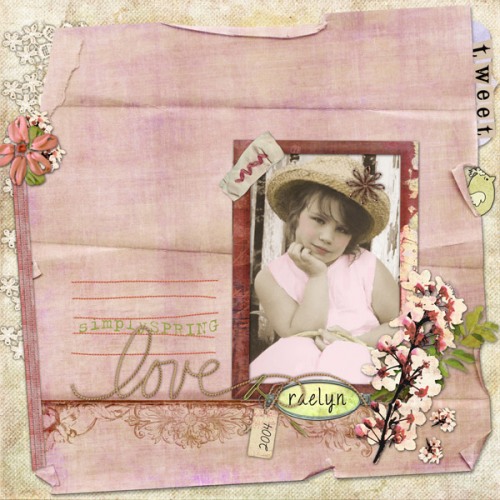
Love by Beth Ervin. Supplies: Faint Whispers Pak (papers re-colored) and Nature’s Sketchbook Elements 3; Simply Spring; Scrap.Words Simply Spring, Nature’s Sketchbook Elements 2 – Harmony (old alphaset); Play and Grow Forever Elements (birdie)
Photos to be hand-tinted should be black and white (or monochromatic) without a lot of pure white or pure black areas. For hand tinting, a lack of sharp contrast can actually be helpful. Select an image without too many tiny details and with large expanses of one color. What we are looking for is not truly life-like color, but a decorative and subtle effect. Essentially, we cant tint as little or as much of the image as we like, but the effect works best where areas of color are contrasted with the grayscale image.
Here is a super easy technique to create a digitally, hand-tinted photo using Adobe Photoshop Elements (Photoshop and Paint Shop Pro are very similar in steps):
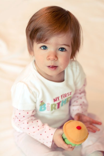
Open your digital image.
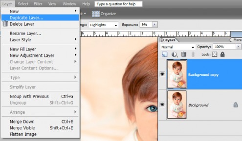
Duplicate the image in a new layer by selecting Layer>Duplicate layer.
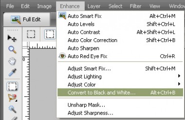
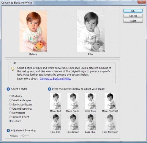
Make the new layer active and convert to black and white by selecting Enhance>Adjust Color>Remove Color or Enhance>Convert to Black and White.
I often add a bit more contrast than the original option. See the Adjustment Intensity slider at bottom left to control the amount. Click More Contrast image to add more contrast. Just keep playing…you can always hit Reset button at top right to start over! Note…for a very aged image effect, less contrast is preferred.
There are many other ways to convert an image to Black and White, but this one is so easy and offers many customization options with great results.
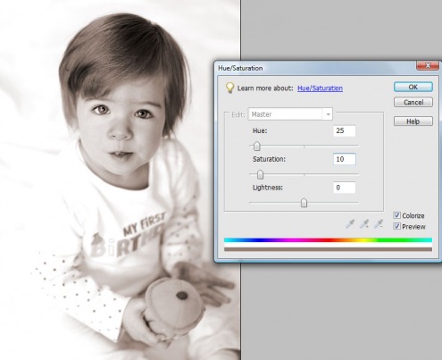
For this example, I used a sepia image instead of black and white to warm the final image. You can easily convert your black and white image to sepia by selecting Enhance>Adjust Color>Adjust Hue and Saturation (Ctrl-U, Cmd-U on a Mac). In dialog box, check Colorize box and set Hue to 25 and Saturation to around 10-20 (depending on your taste).
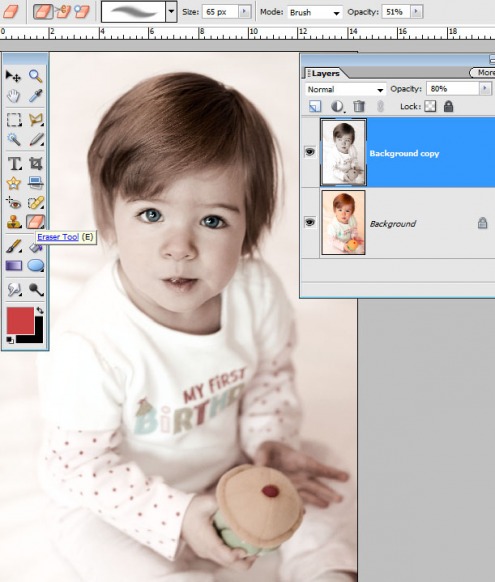
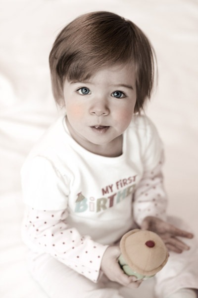
On the monochromatic image layer (top layer), zoom in on area you want to have color (such as eyes, cheeks and lips), choose a soft eraser brush tool set at a very low opacity (around 10-20%) and erase away the sepia, leaving your color layer underneath. For this image, the process took less than two minutes. I then also decreased the opacity of this layer to 80% so a bit more overall color came through. You can spend more or less time depending on the final purpose. If you have added too much color back in to the image, you can use your Undo History palette to return to a previous step.
michelle shefveland
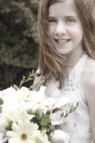
Here’s another example using the same technique.
michelle shefveland
Note: For those more advanced in knowledge of image editors, you can add a layer mask to the monochromatic layer and paint “on” areas you want to mask “off” the monochromatic areas of color. This allows you to go back in and make changes to your work more easily by painting white in the mask over any areas that have too much color.
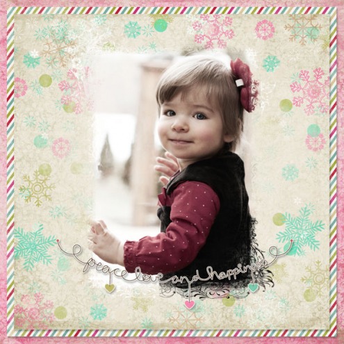
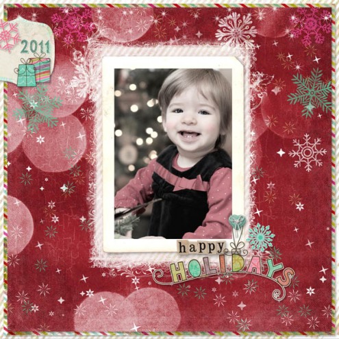
michelle shefveland. supplies here
As you become more comfortable with hand tinting you can move into more challenging techniques. For Beth’s images and my holiday photos we also added color. In Beth’s image in Love (at top), she painted the subject with a dry media brush at 15% opacity on a new layer, after first converting the black and white image to sepia.
For mine I first used my technique above, then sampled the color of the little girl’s dress and similarly added more soft color to her cheeks. Setting this added color layer to Color blend mode often gives it a beautiful blush-like, translucent quality.
Have fun!
Michelle and Beth
michelle shefveland. supplies here
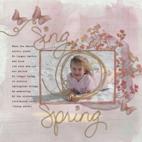
Sing Spring by Beth Ervin. Supplies: Floral Pansy Plumes (background, mat), Simply Spring Scrap.Words, Nature’s Sketchbook Elements 3

