|
 |
|
|

Newsletter
Volume 4, Issue
2
Welcome to the
August 2007 edition of the
Simply Digital Newsletter!
Our oldest is a senior this
year...wow. I remember vividly coming home from the hospital 17 years ago in
sweltering heat, with no air conditioning in the car, and scared to death that
we would get in an accident in the 10 minute drive home. She was such a little
peanut, yet in the blink of an eye has grown into a caring adult with a job at
the hospital and dreams to be a dietician. They say the senior year goes by even
faster than the rest...I'm trying to savor this last year, but bet it will fly
by before I have time to really comprehend the changes that will soon take
place. I do miss those days with three little ones consuming my days and nights.
But...on the bright side, I've
captured hundreds of grad photos this summer, shared many laughs with Alyssa,
and had fun looking
for catchy props and locations. See below for some random tips on taking grad/teen
photos.
Our
recent digital art,
Naturals 3 and 4 Paper Paks, complements edgy
teen photos, as well as your boisterous little ones, nature, pets, and everyday
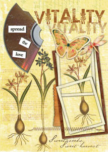
moments. I love Beth's nature collage at right!
We have a new section in our store,
Simply $1, which will have a revolving
inventory of our products available for purchase for just $1! Check it out
here.
Jana Holstein from Somerset Memories asked me to let
you know about their special issue, Somerset Digital Studio, completely devoted
to digital. Send them your work! See below for details.
Have a great week!
 |
Michelle Shefveland, Founder,
and the team at CottageArts.net
|
|
[forward-Click here to forward this newsletter to a friend]
[subscribe-Click here to subscribe to the Simply Digital Newsletter]

Introducing our new bargain shop,
Simply $1, which
will have a revolving selection of our digital products.
Vitality Collage by Beth Ervin.
Supply
List
AND more
Design Team Layouts...

|
|
|
|
New Downloads & Inspiration:
Naturals 3 and 4 Paper Paks
More Design Team Layouts
|
 |
 |
|
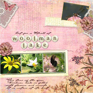
Woolman Lake by Kaitlynn Gonzalez |
Beauty by Debbie Newton |
|
 |

|
|
|
|
|
Teen/Grad
Photo Shoots:
The key to a successful shoot with a teen
or grad is to make it fun and make your subject feel comfortable with
themselves and you! Here are a few random tips from my experience...
Get close
and personal images, as well as distant shots with a cool backdrop.
Have the subject change their look, as
well as their clothes. Be serious, silly, smart, innocent,
contemplative.
Have your
teen walk on a balance beam at a park or a railroad track (that is no
longer in use), and catch their laughter as they teeter back and forth.
Look for
retro chairs, doors, props, at garage sales to use on the shoot.
Take group images of friends, as well as
individuals, so they have keepsakes of those most special to them at
this time of their lives. This will also loosen them up for their
individual shoot.
Common
poses for the yearbook are more traditional with eye contact and a
smile. But, your teen will most likely cherish the images that capture
their personality or special interest.
Check out
your local graffiti or garden park.
|

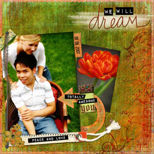
We Will Dream by Michelle Shefveland.
Supplies here
Shoot in early morning or early evening
for beautiful golden light. Overcast days offer great lighting, as well,
as shown in the layout above.
Take shots when they are unaware. Enjoy
the time together and laugh a lot! |
|
|
Special Offers from CottageArts.net! |
| Coupon Code |
Discount |
|
NA |
 |
|
NLPRIORITY |

FREE USPS PRIORITY MAIL SHIPPING
for US orders over $75 -
enter Coupon Code NLPRIORITY during checkout
(Limited Time Offer; Only one coupon code allowed per order)**
|
|
|
Somerset Digital Studio Magazine - Call for submissions
Digital artwork is HOT right now and we’re super excited
about the premier of a new publication that will feature all digital designs.
Somerset Digital Studio will focus on all things digital — scrapbook pages,
ATCs, collages, cards, invitations, calendars, clothing, heritage pieces —
anything that is unique, distinctive, artistic and created digitally.
Be awed and inspired by this full-color 144-page magazine
devoted to digital art to be released in March 2008!
Deadline for submissions: November 15, 2007
Submission Guidelines:
In order to be considered for publication in
Somerset Digital Studio,
please send via e-mail the following for each submission: a high-res image (300
dpi, at least 6 x 6 inches), a brief paragraph describing the artwork (who's who
in any photos or why you were inspired to create it), instructions on how you
created your digital artwork including the specifics as to what tools, programs,
etc. you used. Please include your name, e-mail and mailing address with every
submission. E-mailed submissions should be directed to the managing editor, Jana
Holstein, at somersetdigital@stampington.com. Please put “Somerset
Digital Studio” in the subject line. For more information, visit
www.stampington.com.
|
|
|
 
Family
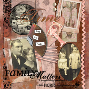
Matters and Beloved by Beth Ervin.
Supply Lists here
Beth's Corner:
Digital Altered Art Tips
What is altered art?
In a nutshell...COLLAGE. Collage encompasses both art and craft. One
of the most expressive and versatile art forms, it lends itself to
many different applications - including digital! Any of the Cottage
Arts papers and embellishments can easily be printed and altered by
tearing, painting, inking, stamping, etc. Or, altered looking
layouts can be created digitally by using your photo editing
software and a little imagination. Altered books, cards, framed art
and more recently, altered scrapbooks, are all wonderful creations
that allow us to break out of our “cookie cutter” molds. It’s so fun
to pull out all the stops and engage in such a freeform style of
scrap booking.
Inspiration for altered art is found within your photos, the rest is
up to you! When I sit down with a stack of photos to begin designing
an altered style page, I spread them out in front of me and take a
good long look. I consider the theme, story or event, colors, shapes
and even the texture present in the images. After selecting the best
shots to add to my layout, I begin to create by choosing papers and
collage elements that enhance the photos and bring them to life. If
there is a lot of action in the photos, I make sure this energy is
carried over into my layout by echoing a focal point or detail in
the photo. For instance, mimicking polka dots from a person’s
clothing by using circular shapes would greatly enhance the photo.
On the other hand, if the event is a classy night out, I would keep
the colors simple and use elegant embellishments.
Color can make or break a layout.
Cottage Arts Naturals Paper
Collections come in fabulous muted tones…color, sepia and black and
white photos all look great on these papers. I usually use shades
from the photo colors, instead of trying to match them exactly, and
then add complementary colors. If the photo is light nearest the
edge, I go with a darker background paper. The tiniest of details
can pop when a variation of color is used in the background. It
draws the eye right to it.
|
|
|
|
Aug 2007 Simply
Digital Newsletter URL: http://www.cottagearts.net/sdnews1/heat9876/sdnewslettervol4iss2.html
2003-2007 (C) CottageArts.net, LLC - All
Rights Reserved
CottageArts.net, LLC - 2044 High Dr - Sauk Rapids, MN 56379 |


