
|
|
Colorization Techniques with
![]()
(Adobe®
Photoshop® and Photoshop Elements, Corel® PHOTO-PAINT,
Ulead PhotoImpact 7 and higher, and Microsoft® Picture It!® Digital Image
Pro would follow similar instructions)
|
Hi, my name is Leila and I’m a colorization addict. I love toying with hues, saturation, tones, brightness and contrast. And, I’m always intrigued by the millions (16 million) of choices that I have when it comes to color. When I started using Paint Shop Pro, I was purely a Hue & Saturation>Colorize kind of girl. Today, I’ve found several more fun ways to add (and remove) color from images. |
|
|
What you’ll need:
What I’ll cover:
|
|
|
Open Jasc Paint Shop Pro Open photo(s) or background image of choice |
|
|
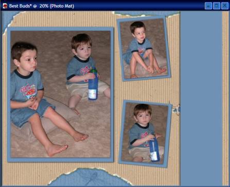
Colorize I used the "Best Buds" fully-layered layout template from Simply Shabby for my first layout. After making some changes to the basic layout and rotating it 90 degrees counter-clockwise, I colorized the lime green portions of the background, as well as the photo and poem mat, so that they coordinated better with the pictures I chose. To make the
color changes, I used my
Mode= Replace
|
|
|
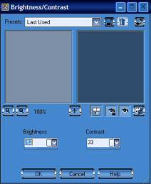
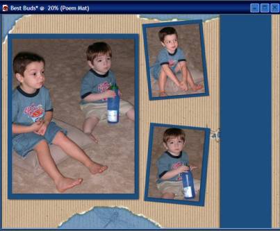
Brightness & Contrast I wanted the photo and poem mats to be darker, somewhere between the t-shirt body color and the neck color. For this, I used Brightness & Contrast Select the desired layer in layer palette. Choose Adjust > Brightness and Contrast > Brightness/Contrast
I used the settings you see to the right (Brightness= -52 Contrast= 33) You may have to play around with the settings until you find the color you like best.
|
|
|
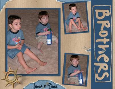
I made some adjustments to the placement of my photos, added a sun charm element from Simply Shabby and some text for the finished product.
|
|
|
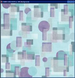
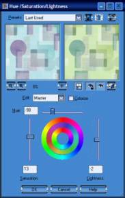
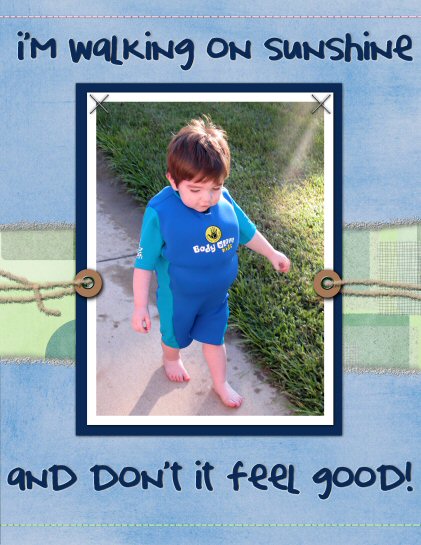
Hue/Saturation/Lightness For my next layout, I used a picture of Devin in his Body Glove swimsuit that I wanted as my focal point. The colors were very bright royal blue and turquoise, so I wanted coordinating colors in softer tones. I found the background called Funky Cool Blues was a good pattern, but the colors were off some. Wanting to retain the color variations, I chose to use Hue/Saturation/Lightness, rather than Colorize, to make my adjustments. I used the settings you see to the right (Hue -98, Saturation 13, Lightness -2) to give me the soft green/blue shades. |
|
|
After cropping the background to 8½x11, I added the stitched watercolor paper from Simply Kids, created torn edges (using AutoFX’s Dream Suite 1 Deckle filter), added my photo, and some elements for the finished look. Design Tip: Paint Shop Pro can make some great torn edges, as well, and are described in the book, Scrapbooking the Digital Way, available in our store. Supplies Used in "Walking on Sunshine" layout:
Software:
PSP 8.1
AutoFX Dream Suite 1; Deckle
Papers/Elements:
Funky Cool Blues 12 Paper; Simply
Kids CD
Stitched Watercolor Paper; Simply Kids CD Fasteners and Fibers; Simply Kids CD Staple X; Simply Kids Cd
|
|
|
Color to Target Brush
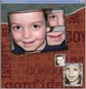
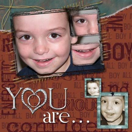
The color change in my final layout is subtle, and the method is very simple. I wanted a very masculine look for this layout, which starts with the All Boy Caramel 12 background paper from Simply Stated, and some fun photos of JP. After adding in the photos and some elements, I tore the top corner of the background paper (using AutoFX’s Dream Suite 1 Deckle filter) to reveal the deep teal crumpled background I created.
|
|
|
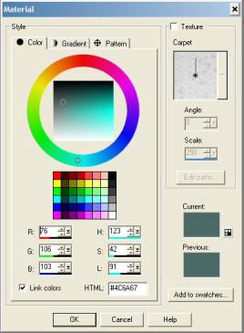
I want to tie
the teal into the layout a bit more, so I’m going to use my
R:76 With your metal frame layer highlighted, select your Change to Target brush. Specific settings for this brush are completely up to you. I used the following:
Shape: Round
|
|
|
Using the brush, simply paint this new color all over the frame. Nothing outside of this layer can be painted. Repeat for the smaller frame. I added in the Black Star from Simply Stated as brads on the frames, and used the "You Are" title art also from Simply Stated to finish the layout. Supplies Used in "You Are" layout:
Software:
PSP 8.1 (My copy of v9 is on
its way!)
AutoFX PGE 6.0; Montage
AutoFX Dream Suite 1; Deckle
Alien Skin Xenofex 2; Crumple
Papers/Elements:
All Boy Caramel 12; Simply Stated CD
Metal Stencil Alpha Set
(downloadable Alpha); Frame
Black Star: Simply Stated CD
Fall Kit (downloadable page kits):
Fall Strings and Fall Mesh
You Are Title: Simply Stated CD
|
|
Written by Leila Schweiss. CottageArts, LLC, Copyright 2004, All Rights Reserved